Demographic Transition Model which is an important topic in Human Geography. We will discuss the main facts about it. The Demographic Transition Model is a theory on which human geography is based. Let’s see what is meant by this theory. First, let’s understand what is meant by demographic transition.
Among the various humanities-based information that is available, this is one of the parts of human geography. Here we will first know what is meant by the term demographic transition model or theory. It must be according to the dictionary of human geography.
According to the dictionary of Human Geography, a general model describing the evolution level of fertility & mortality over time. It has been developed with particular emphasis on the experiences of developed countries. To put it simply, Demographic Transition is the process by which people’s lives change over time. It doesn’t just happen to people. It happens within a country. It’s very important that change happens.
How does a country change? Population growth, human race, births and deaths depend on it. The Demographic Transition model is the information that reveals how a country, a city or a region’s population is growing or decreasing based on the births and deaths of people.
The Demographic Transition model has been given in different ways by different scientists at different times. Among them are Thomson and several notable people. The information that we will discuss here is not specific. We will discuss here the concept that is normally understood by Demographic Transition.
What Happened During Unique Demographic Transition Model
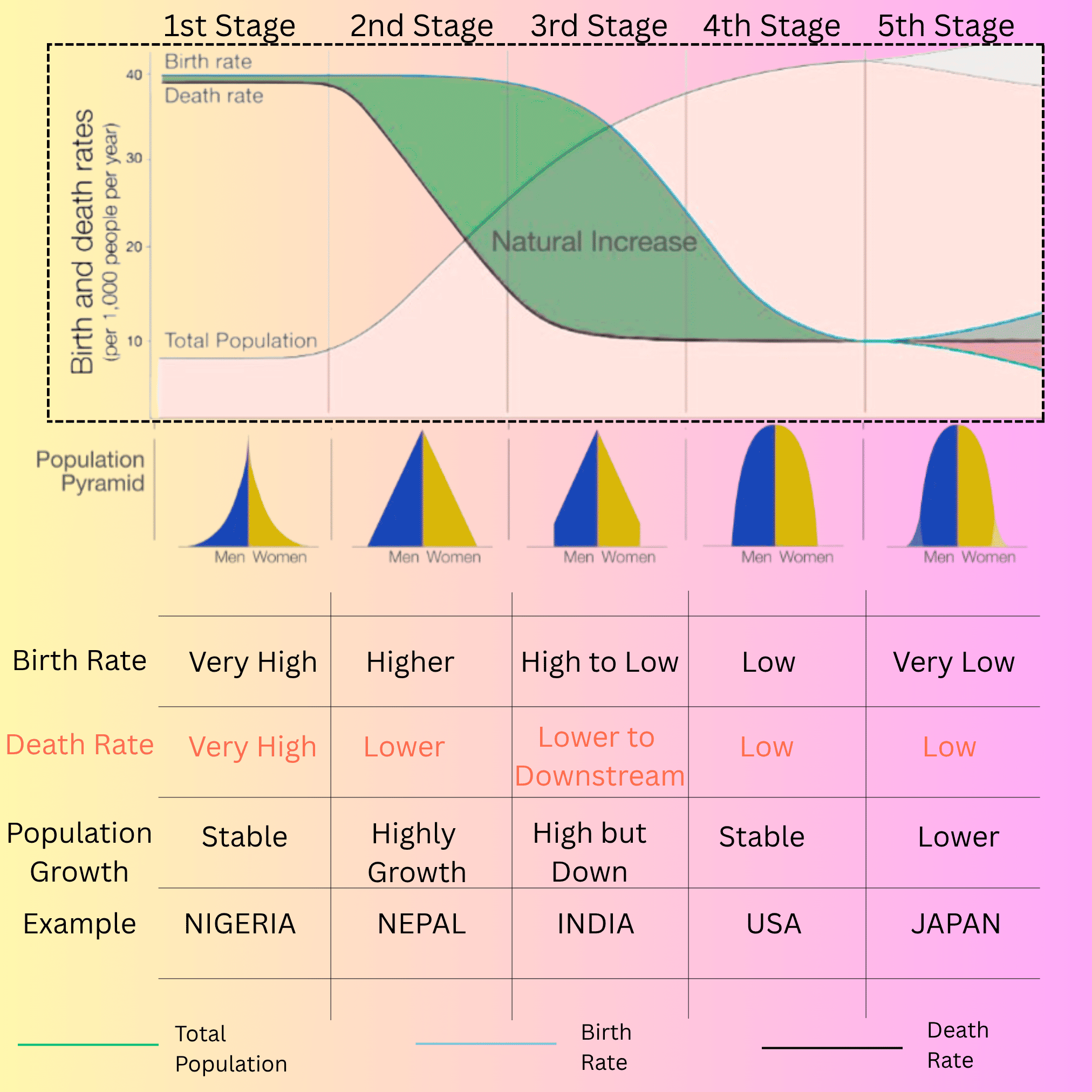
Let’s take a look at the diagram given here. All the information is hidden in the diagram. To know the Demographic Transition model, you need to understand the diagram well. In the case of Demographic Transition, along with the development of a city and a country, attention is paid to how the population of that country is growing. There, birth rate, death rate, and industrial development are all interrelated. Finally, we can find out what that country is becoming through the Demographic Transition model.
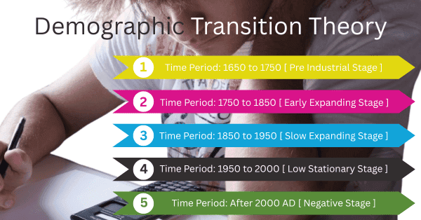
Look, there are a total of five stages in the Demographic Transition model.
The First Stage of the Demographic Transition Model Value
In the first stage, the time period is assumed with respect to the United Kingdom. Not at all for India. This information has come up with respect to European countries or Britain. However, if we compare it with India, we will find almost the same. Since it is written about a developed country, Britain has been taken as an example.
The time period in the first stage can be said to be 1650 to 1750 keeping in mind Britain. Moreover, this stage is called the pre-industrial stage. At this time, there was no industrial development. People were completely dependent on agricultural work or primary activities. And if we think with respect to India, then the first stage represents the time when the population was before 1921. What is more, here the death population or mortality rate is less than 35 out of 1000. That is, the population does not increase or decrease in that way. It means it is in a stable condition.
Here, everything like fertility, mortality, mobility all depend on 1000. Now, it is observed that people under 35 are dying. In all cases it is seen that there are no such births or deaths.
Look the view of Graph for 1st Stage:
Now let’s look at our graph. It is clear from the graph that there are five stages. In the graph, the sky line represents the birth rate, the black line represents the death rate and the green line refers to the total population curve. In the scale shown on the left of the graph, 1 centimeter represents the birth and death rate in ten thousand. Now let’s look at the first stage. This is the pre-industrial stage. Here, neither birth nor death can be observed as such. It is in a stable condition. The lower portion of total population i.e. population growth is not noticed.
Here you can see some more characteristics. For example, the shape of the age sex pyramid. The age sex pyramid of the countries in this position is pointed at the top and wide at the bottom. This means that the number of children is high and the number of elderly people is low. Urbanization has just started here. In this situation, the birth rate is high. The death rate is also very high. Because at that time the medical system was not improved. People died due to diseases. It is seen that as many people are born, the same number of people are dying. That is why the population is in a stable condition.
When we talk about the names of the countries in this position, the first name that comes to mind is Nigeria. Also, most of the underdeveloped countries of South Africa fall under this category.
The Second Stage of the Demographic Transition Model Value
Now let’s come to the 2nd stage period. Here the time period is 1750 to 1850. This is called the early expanding stage. It is called the stage before it rises very high. Here the normal population is considered to be 15 to 35 out of 1000.
In this stage, overpopulation, that is, population explosion, occurs. A large number of people are born, but accordingly the death rate of people is low. Because science has developed by then and the medical system has improved to some extent. It is not that many people will die unnecessarily. Here the exploration of population can be seen.
Look the view of Graph for 2nd Stage:
Now let’s look at the diagram graph. Here it is seen that the birth rate is very high. But the death rate has decreased a lot. So the population is growing rapidly. In other words, the total population line graph is upward. In the second stage portion, the upper portion indicates overpopulation or exploration of population. Here the stage of sex pyramid is completely triangular in shape. It is clear that the birth rate of children is high and the birth rate of adults is quite low.
Here, the birth rate is high and the death rate is lower. The first reason for this is that the medical system has improved. Population growth has increased tremendously. For example, Nepal can be taken as an example. Where the population is gradually increasing. Due to this, the environmental condition there is decreasing day by day.
The Third Stage of the Demographic Transition Model Value
Now we will go to the third stage. Which is the slow expanding stage. At this time, it is seen that the birth rate is also starting to decrease. The death rate is decreasing, but the birth rate is also decreasing. This is called the Modern Western Stage. From this time, the Western part is entered. That is, the front of the condition in which England stands with the current time schedule is assumed.
From this time on, people started to understand that population control is very important. That is represented here by graphs and through various means. From this time, people started to understand that population control is very necessary. That is represented here by graphs and by various means. At this time, the birth rate is 20 out of 1000. Where in the second stage the birth rate was 35, it has decreased a lot. That is, the population has been controlled a lot. And the time period is from 1850 to 1950. That is, it has been going on for a period of 100 years.
Look the view of Graph for 3rd Stage:
Now if we look at the graph, we will see that in the third stage, the birth line, i.e. the pink line, has moved downwards. And this means that the birth rate is continuously decreasing. Along with it, the black line, i.e. the death rate, is also decreasing. Here, although the birth rate and death rate are decreasing, the population is increasing. This is because of the effect of the birth rate being exploited from the beginning. As a result, the shape of the age-sex pyramid is in the form of a dome. The population of people aged 30 to 50 is almost the same as that of children, but it has increased slightly towards the top.
The birth rate ranges from high to low. And the death rate is lower downstream. Population growth is high but downstream. Population growth is increasing but not at that speed. An example of this can be given as India. Currently, the population of India has increased and is increasing. But the rate at which the population has increased since 1921 and the current situation is much under control.
The Forth Stage of the Demographic Transition Model Value
The fourth stage is a little more modern than the moderate one. Here people are completely extinct, so birth control is going on. Along with this, there is death control. This is called the low stationary stage. Here everything like population growth, birth rate, death rate is going down. In this stage, the time period is taken from 1950 to 2000. During this time, zero population growth is seen. The population is decreasing and the death rate has also decreased. At one point, both the birth rate line and the death rate line were intercepted. This means that as many people are being born as are dying. Here, automatically zero population will be seen.
Look the view of Graph for 4th Stage:
We are observing zero population growth in the 4th stage in the demographic transition model. Here, the death population rate has become 10 out of 1000 and the birth rate has become less than 15 out of 1000. It is clear that the birth and death rates are between 10 and 14 at this stage. Here, the shape of the age-sex pyramid looks a little different. Here, the child birth rate has decreased to control the birth rate.
It is mentioned in the demographic transition model graph that both the birth rate and death rate are low in this 4th stage. And, population growth is stable or zero. An example of this stage can be taken as the USA. Apart from this, many European countries are also included in this stage.
The Fifth Stage of the Demographic Transition Model Value
Now we will discuss the last stage i.e. the 5th stage. Where people are not being born in the same way. The death rate is increasing compared to the birth rate. This is called the negative stage. Because the death rate is higher than the birth rate. The time period of this stage is after 2000 AD.
Here, the birth population is less than 7 out of 1000. And the death population is less than 15 out of 1000. Here, 7 people are born but 15 people are dying. Of course the population growth is low.
Look the view of Graph for 5th Stage:
If you look at the graph, you will know that at this stage the death rate has risen above the birth rate. Here natural fall is being observed. Again the population growth line graph is coming down at this stage. In other words, there is a natural decline.
Here, we can see that the birth rate is very low. The death rate is low. Compared to the previous one, it can be said to be stable. Population growth is lower.
For example, Norway and Japan can be taken as examples. The birth rate has decreased so much that people there think that after a while only the city of death will be visible.
This Demographic Transition Model [DTM] has been studied by various researchers, among which Thomson is particularly notable.
Conclusion:
Anything that increases after a period of stagnation is not called population growth. If you identify a thing, you will see that as the price of the thing increases, after a period of time the demand will decrease and the price will continue to decrease. Of course, it will continue even if it is not valuable. That is, when people understand that the demand has become exceptional, its price will continue to fall.
FAQs
Q1. What Are the Limitations of the DTM Model?
The Demographic Transition Model (DTM) has several key limitations. No doubt, it ignores external influences such as migration, conflict, and epidemics. Relies on a simplified framework rooted in Western European history. Which does not reflect the diverse patterns of development worldwide. It lacks a fixed time frame for the transition. It also fails to integrate cultural, social, and political dynamics. Besides, fail the effects of globalization as well as many government policies.
Q2. Mention the Cons of DTM?
DTM population growth is a strong determinant. It does not outright the account for migration. It just accounts for births and deaths in any country. Thus, it ignores various factors.